Marco Altini
  • Home
  • Research & Publications
  • Apps & Projects
  • Blog

Map your trips using pics from your phone (+ R code)

23/12/2014

0 Comments

 
Picture
Picture
my geotagged pics in 2014 and between december 2011 and april 2015
For  a while I wanted to map my flights and the locations I've spent time in throughout the year, so last night I downloaded my location data, which I thought I was tracking for a long time using a few apps. Unfortunately that was not the case. Turns out most apps were not running in the background, and I forgot to start others after rebooting my phone. 

What to do? There's one thing I always do. Taking pictures. Everywhere. These days most pictures are geotagged, or at least the ones taken using smartphones. I found a couple of tutorials online on how to extract metadata from JPEGs in R and Python, and eventually worked with R since thanks to Nathan Yau and this post, I could make better looking maps. Another helpful post was on timelyportfolio, explaining how to extract exif metadata using  exiftool and R. 

Quickstart

I haven't tested much the code, but if you are lucky, this should be sufficient to make your own map:
  • get the code from github
  • download and install exiftool, which is called by the R script
  • download your pics from your mobile phone (I used Dropbox Camera Uploads)
  • set the path to your pics folder in the R script
  • run the script
The map will be exported as pdf in the same folder you set as path.
Here are a few more details on how the whole process works. Please refer to the code on github for an updated version, the code copied here was modified to fix a couple of bugs.

jpeg to coordinates

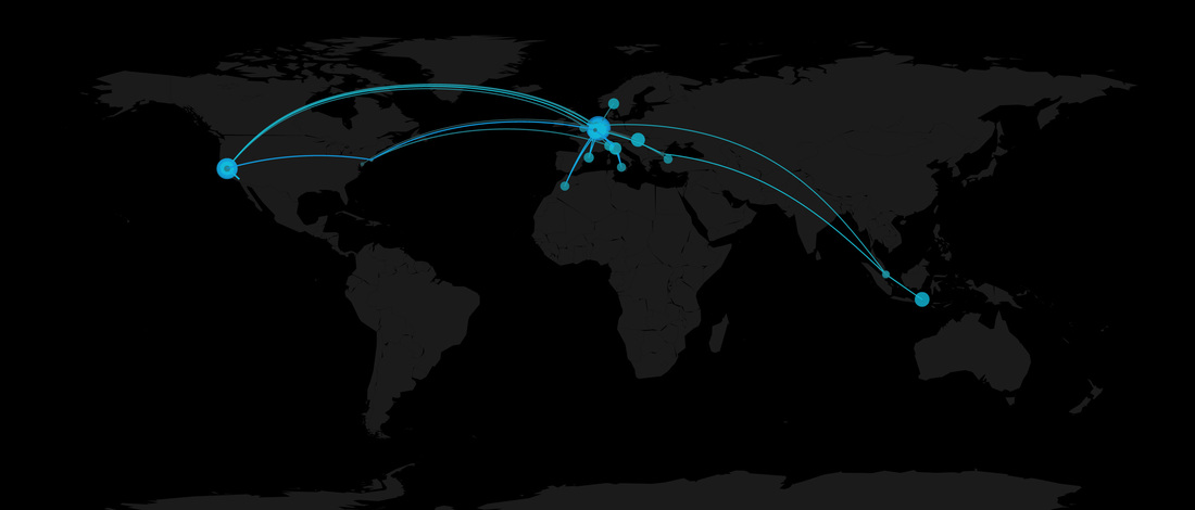
The script uses exiftool to get metadata from JPEG images. Exiftool lets you specify what to extract, so for this application we need only GPS coordinates and dates. Coordinates will be used to draw great circles between locations which are farther than a certain distance threshold, while coordinates together with dates (actually time spent in each place) will be used to draw filled circles on the locations themselves, as shown in the top picture. Extracted data is stored in a data frame called picsLocations:
 info <- system(paste("exiftool -GPSLatitude -GPSLongitude -DateTimeOriginal '", picsPath,"'",sep=""), inter=TRUE)
picsLocations <- c()
for(indexLine in 1:(length(info)-2))
{
#latitude and longitude come sequentially (check needed since sometimes only one of the two is retrieved)
if(length(grep("GPS Latitude", info[indexLine]) > 0) &
length(grep("GPS Longitude", info[indexLine+1]) > 0) &
length(grep("Date", info[indexLine+2]) > 0))
{
#new pic with GPS data found - extract coordinates
coordinatesDegreesLat <- strsplit(info[indexLine], "[ ]+")
coordinatesDegreesLon <- strsplit(info[indexLine+1], "[ ]+")
coordinatesFloat <- convertCoordinates(coordinatesDegreesLat, coordinatesDegreesLon)
date <- strsplit(info[indexLine+2], "[ ]+")[[1]][4] #get date only
date <- as.Date(date, "%Y:%m:%d")
picsLocations <- rbind(picsLocations, c(coordinatesFloat[[1]], coordinatesFloat[[2]], date))
}
}
picsLocations <- data.frame(picsLocations)
colnames(picsLocations) <- c("latitude","longitude","julianDate") #julian dates since we need only days differences
Coordinates are retrieved in degrees, so we need to change the format to floats (needed by the R map):
 convertCoordinates <- function(coordinatesDegreesLat, coordinatesDegreesLon)
{
degs <- as.numeric(coordinatesDegreesLat[[1]][4])
mins <- as.numeric(gsub("'","",coordinatesDegreesLat[[1]][6]))
secs <- as.numeric(gsub("\"","",coordinatesDegreesLat[[1]][7]))
ref <- gsub("\"","",coordinatesDegreesLat[[1]][8])
if (ref == "N")
{
coordinatesFloatLat <- degs + mins/60 + secs/3600
} else {
coordinatesFloatLat <- 0 - degs + mins/60 + secs/3600
}
degs <- as.numeric(coordinatesDegreesLon[[1]][4])
mins <- as.numeric(gsub("'","",coordinatesDegreesLon[[1]][6]))
secs <- as.numeric(gsub("\"","",coordinatesDegreesLon[[1]][7]))
ref <- gsub("\"","",coordinatesDegreesLon[[1]][8])
if (ref == "E")
{
coordinatesFloatLon <- degs + mins/60 + secs/3600
} else {
coordinatesFloatLon <- 0 - degs + mins/60 + secs/3600
}
return (list(coordinatesFloatLat, coordinatesFloatLon))
}
The next step filters data. We might have a ton of pics in certain locations (holidays?) and very few in other places. However, we care only about the single locations, since they are used to draw great circles, representing flights. Also, since we want to plot filled circles representing time spent in each location, we need to cluster pics taken in the same place as a single data point. We do this in a rather simple way, by computing distances between consecutive coordinates and filtering out all points which are too close to each other (where close is defined as 300 kilometers for my map). Additionally, we determine the time spent and the amount of pictures taken in each location:
 #order by date (should be already ordered)
picsLocations <- picsLocations[order(picsLocations$julianDate), ]
picsLocations[, "distance"] <- c(0, getDistance(picsLocations[1:(nrow(picsLocations)-1),]$latitude,
picsLocations[1:(nrow(picsLocations)-1),]$longitude,
picsLocations[2:nrow(picsLocations),]$latitude,
picsLocations[2:nrow(picsLocations),]$longitude))
#filter out locations closer than distThreshold kilometers
#compute time spent in each location
#determine number of pics taken per location
distThreshold <- 300
picsLocationsReduced <- c()
#do this in a loop to keep track of how many pictures were taken
picsHere <- 1
timeHere <- 1
for(indexPic in 2:nrow(picsLocations))
{
if(picsLocations[indexPic, ]$distance > distThreshold)
{
picsHere <- picsHere + 1
timeHere <- timeHere + picsLocations[indexPic, ]$julianDate - picsLocations[(indexPic-1), ]$julianDate
picsOverTime <- round(picsHere/timeHere, 1)
picsLocationsReduced <- rbind(picsLocationsReduced, cbind(picsLocations[(indexPic-1), ], picsHere, timeHere, picsOverTime) )
#reset variables
picsHere <- 1
timeHere <- 1
##add last one
if(indexPic == nrow(picsLocations))
{
picsLocationsReduced <- rbind(picsLocationsReduced, cbind(picsLocations[indexPic, ], 1, 1, 1) )
}
} else {
picsHere <- picsHere + 1
timeHere <- timeHere + picsLocations[indexPic, ]$julianDate - picsLocations[(indexPic-1), ]$julianDate
picsOverTime <- round(picsHere/timeHere, 1)
##add last one
if(indexPic == nrow(picsLocations))
{
picsLocationsReduced <- rbind(picsLocationsReduced, cbind(picsLocations[indexPic, ], picsHere, timeHere, picsOverTime) )
}
}
}
The helper function to compute distance between coordinates can be found on github at the beginning of the script. I also added an extra line of code to compute time spent in different places on a logarithmic scale. I find the visualization better looking this way, since different circles are "more similar", otherwise if you spend a long time in a single place you won't be able to see much else.

plotting

The data frame is complete. Time to plot it. Drawing the map is rather simple. As explained very well in this post. Here I simply added a few lines to plot filled circles depending on how much time we spent in each location, and changed a few colors:
 scaleFactorCircles <- 5
alphaLevel <- 0.8
pal <- colorRampPalette(c("#333333", "#12c4db", "#1292db"))
colors <- pal(100)
pdf(paste(picsPath,"map.pdf",sep=""), width=22, height=14)
map("world", col="#1b1b1b", fill=TRUE, bg="#000000", lwd=0.05)#, xlim=xlim, ylim=ylim)
for (indexLoc in 1:(nrow(picsLocationsReduced)-1))
{
currLat <- picsLocationsReduced[indexLoc,]$latitude
currLon <- picsLocationsReduced[indexLoc,]$longitude
nextLat <- picsLocationsReduced[(indexLoc+1),]$latitude
nextLon <- picsLocationsReduced[(indexLoc+1),]$longitude
daysDiff <- picsLocationsReduced[(indexLoc+1),]$julianDate - picsLocationsReduced[(indexLoc),]$julianDate
inter <- gcIntermediate(c(currLon, currLat), c(nextLon, nextLat), n = 100, addStartEnd = TRUE)
colindex <- round( (indexLoc / nrow(picsLocationsReduced)) * length(colors) )
lines(inter, col = colors[colindex], lwd = 2)
colindex <- round( picsLocationsReduced[indexLoc,]$days/maxDays * length(colors) )
points(currLon, currLat, col = alpha(colors[colindex], alphaLevel), pch=16, cex = picsLocationsReduced[indexLoc,]$days/maxDays*scaleFactorCircles)
}
dev.off()
That's it. 

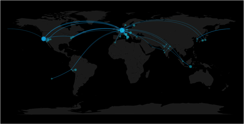
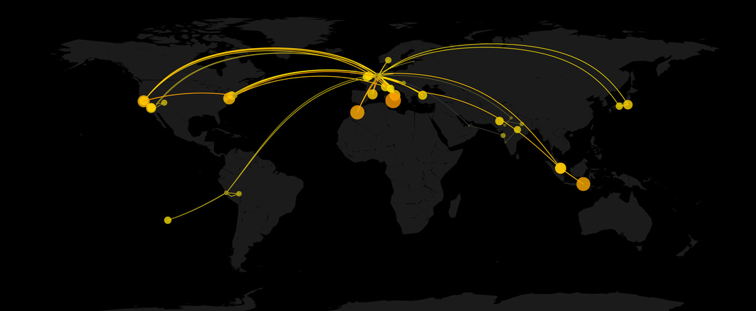
You can remove the filled circles by commenting out the last line of code inside the for loop or edit thresholds, colors and transparencies easily.

Here I plotted all pictures on my phone. In the second plot I used a slightly different method (also available on github) to plot filled circles based on the number of pictures taken in each place, normalized by the time spent in that location. The map at the beginning of this post, where all locations are clustered by year, is also available on github.
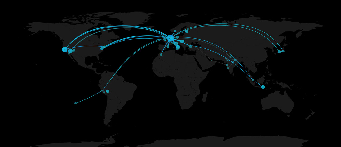
Picture
Picture
Follow @marco_alt
0 Comments

Your comment will be posted after it is approved.


Leave a Reply.

    Marco ALtini

    Founder of HRV4Training, Advisor @Oura , Guest Lecturer @VUamsterdam , Editor @ieeepervasive. PhD Data Science, 2x MSc: Sport Science, Computer Science Engineering. Runner

    Archives

    December 2022
    August 2022
    June 2022
    April 2022
    March 2022
    February 2022
    January 2022
    December 2021
    November 2021
    October 2021
    September 2021
    July 2021
    June 2021
    May 2021
    April 2021
    March 2021
    February 2021
    January 2021
    December 2020
    November 2020
    October 2020
    September 2020
    August 2020
    July 2020
    June 2020
    May 2020
    April 2020
    March 2020
    February 2020
    January 2020
    November 2019
    October 2019
    May 2019
    April 2019
    March 2019
    November 2018
    October 2018
    April 2018
    March 2018
    June 2017
    December 2016
    July 2016
    March 2016
    September 2015
    August 2015
    May 2015
    March 2015
    February 2015
    January 2015
    December 2014
    May 2014
    April 2014
    January 2014
    December 2013

    RSS Feed

  • Home
  • Research & Publications
  • Apps & Projects
  • Blog